What Your Desk Backdrop Says Before You Do
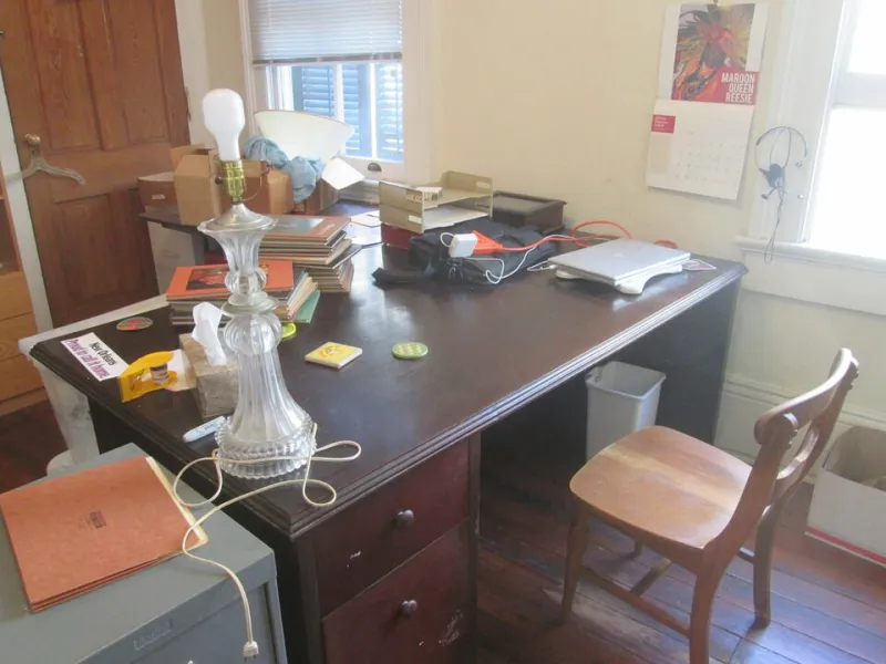
Photo: Infrogmation of New Orleans, CC BY 2.0, via Wikimedia Commons
There is a particular kind of disappointment that comes from thinking your desk wall looks great, then catching yourself on a video call and realising the print behind you has become a pale smudge. The room is fine. The print is fine. The webcam is doing what webcams do: flattening contrast, shifting colour and squeezing everything into a narrow crop behind your head.
A desk backdrop is not the same as a gallery wall. It is a working rectangle, seen through a small lens, usually while you are mid-sentence about a spreadsheet. The good news is that a few practical choices make a real difference. The better news is that you can test most of them with a sheet of A3 paper and your phone before spending a penny.
Start with the crop, not the print
Before you fall for a design, work out what the camera will actually see. Sit at your desk, open your laptop camera or phone selfie camera, and take a screenshot at the angle you normally use. Not the flattering angle. The real one, with your normal slouch and the lamp where it actually lives.
You will probably find that only a band of wall between your shoulder and the top of the frame matters. A print hung at eye level when you are standing may be almost entirely hidden when you are seated. A print placed low enough to fill the gap behind your monitor might be cropped into a sliver. Use masking tape to mark the visible area, then hang or mock up inside it.
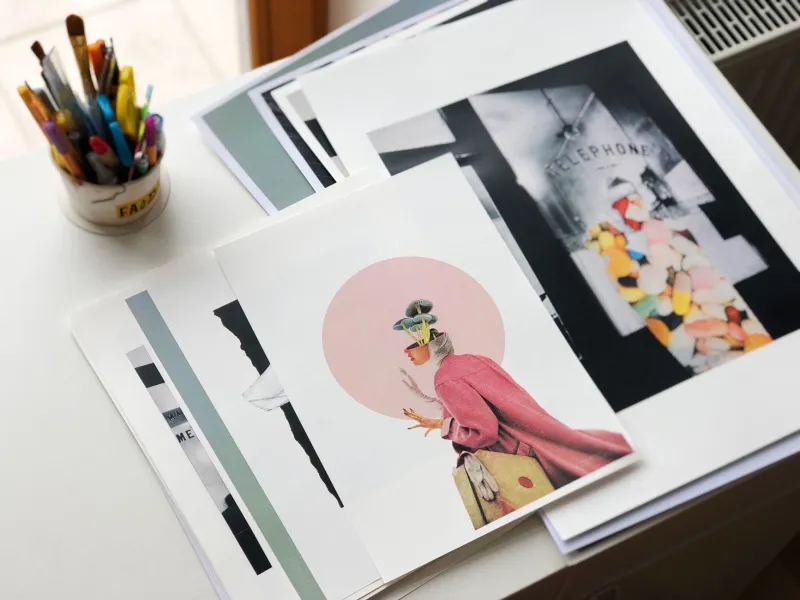
The crop also explains why small prints struggle. A neat A4 illustration that looks charming in the hall can read as a postage stamp on a call. An A3 or A2 print, or a pair of A3s, tends to hold the space better. One generous image usually beats a cluster of tiny ones, especially when the connection drops and the image turns to mush.
Scale is a Goldilocks problem
Too small and the wall looks nervous. Too large and the print starts to compete with your face, which is not the point of a work call. As a rough guide, aim for a print or pair of prints that fills somewhere between a third and half of the visible wall behind you. Leave breathing room around the edges so the crop does not feel like a poster pressed against the ceiling.
Position matters as much as size. Avoid hanging a bold print directly behind your head, where it will look like an accidental halo or a very loud thought bubble. Offset it slightly to one side, or hang it high enough that the top of your head sits against calmer wall. If you use a virtual background, none of this matters, but virtual backgrounds have their own special horror. A real wall is usually better.
Contrast, colour and the webcam compromise
Webcams are not kind to subtlety. Pale prints on pale walls can disappear into a wash of beige. Very dark prints can turn into black rectangles, especially in a room lit by a single warm bulb. The sweet spot is a print with clear shapes, decent tonal contrast and a bit of space between elements.
Colour temperature is the sneaky one. A cool white bulb can make warm paper look grey. A warm lamp can turn a crisp white border the colour of old custard. If your desk lamp is warm and your ceiling light is cool, your print is living in two different seasons at once. Try to light the wall with the same sort of bulb as the rest of the room, or accept that the print will shift after dark and choose something that still works when it does.
Bold reds and saturated oranges can bloom on cheap webcams. Fine line work and tiny text can vanish. Busy film posters with credits at the bottom are often unreadable on screen, though they can still look great in person. If the print is there for atmosphere rather than legibility, that is fine. If you want people to clock the design, keep it simple.
The window, the glass and the glare problem
Glare is the most common own goal. A framed print opposite a window becomes a mirror at the wrong time of day. Glossy glass, dark film art and a south-facing flat are a difficult combination. You do not need to spend a fortune on museum glass. Matte paper, anti-glare acrylic or a print mounted without glass can all reduce the problem. A thin wooden hanger or magnetic poster frame is often enough for a rental-friendly desk wall.
If you cannot move the print, move the light. Angle a desk lamp away from the wall rather than straight at it. Close the curtain behind the camera if the sun is behind you, not in front. A cheap diffuser on a bright bulb can soften the hotspot. These are small adjustments, but they make the difference between a print that reads and a print that glows like a headlight.
The two-minute phone test
Before you buy, mock it up. Tape a sheet of A3 paper to the wall, or use an existing print, and take a photo with your phone from the seated position. Look at the photo on a laptop screen, not just on the phone. Better still, open your usual video-call app and check the preview window with the room lights on and then with the lamp on.
Ask three questions. Does the print still have a shape? Is there glare on the surface? Does it sit comfortably beside your head rather than behind it? If the answer is no, move the paper and try again. This test is free and takes less time than returning a frame.
Affordable framing that does not look like a compromise
For UK desks, the practical options are often the least fussy ones. Thin metal frames with acrylic glazing, simple oak-effect frames from the usual home stores, or magnetic poster hangers from independent print shops all keep costs down. Reuse frames you already own. Buy an A3 print and an A2 mount, or the other way round, rather than paying for a bespoke job you do not need.
If you rent, skip nails and use removable strips rated for the frame weight. Avoid hanging anything heavy above a monitor. Keep the desk wall flexible enough that you can swap a print when you tire of it, because you will. A desk backdrop is not a permanent exhibition. It is a backdrop, and backdrops are allowed to change.
The best desk wall is not the most designed wall in the house. It is the one that gives your call a bit of texture, a bit of personality and nothing distracting enough to pull focus. Start with the crop, test with your phone, and let the print do the quiet work. That is print culture for walls that say something, even when you are on mute.