Live With the Colour First: Why Your Next Print Should Wait for the Paint

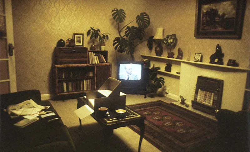
Photo: Unknown authorUnknown author, Public domain, via Wikimedia Commons
The usual order is print first, paint later. You fall for a poster, buy it, bring it home, then realise the wall behind it is a shade of magnolia that makes the whole thing look like a leaflet in a dentist's waiting room. In 2026, with framing costs still high, that is an expensive way round. Paint the wall first. Live with the colour. Then choose the print.
Why the wall gets a vote
A print does not hang in a vacuum. It hangs against a colour, under a light, beside a doorframe and opposite a window. A warm cream wall can make a cool-toned film poster look grey and tired. A deep green wall can make a black-and-white gig print sing. The same poster, same frame, same room, can read completely differently depending on the emulsion behind it. If you choose the print first, you are asking it to fight a wall you have not really looked at.
Undertone is the whole game
UK paint palettes are full of colours that look one way in the tin and another way at 4pm in November. Setting Plaster, Dead Salmon and these warm, dusty neutrals can flatter prints with cream borders and vintage film artwork. Hague Blue, Green Smoke and other deep, saturated shades can make bold graphic music posters feel intentional rather than noisy. Cool off-whites and pale greys are less forgiving: they can drain the warmth from a poster with a lot of red or ochre in it. Buy sample pots. Paint a patch bigger than the print will be. Look at it in the morning, in the afternoon, and under the lamp you actually use.
Finish changes the read
Matt emulsion absorbs light and softens contrast. Eggshell has a slight sheen that can make a wall feel more polished, but it also reflects. If you are hanging a print under glass, a glossy or eggshell wall can create a second reflection that competes with the artwork. In a dark room, a dark wall in a matt finish can make a framed print look like a lit window. In a bright room, a pale wall in eggshell can bounce light onto the glass and wash out the image. Think about the finish before you think about the frame.
Three palettes that play nicely
Warm neutrals are the easy route. Choose a soft clay, plaster or mushroom tone, then pick a print with warm mid-tones and a cream or off-white mount. The frame can be oak, brass or a simple black. Deep greens and blues are for people who want the wall to do some work. Put a strong graphic gig poster or a bold film print against them, and keep the frame slim so it does not compete. Cool off-whites and pale greys are best with monochrome photography, typographic prints and posters that already have plenty of contrast. If the print is pale and delicate, a cool wall will make it disappear.
The A2 test patch
Do not paint a whole room and then discover the colour is wrong. Paint a patch roughly the size of an A2 sheet, or larger if the wall is big. Leave it for a week. Move a lamp near it. Sit on the sofa and look at it from the angle you will actually see the print from. This sounds fussy. It is cheaper than framing a print that then looks wrong.
Frame colour is part of the paint decision
A black frame on a dark wall can disappear, which is sometimes exactly what you want. An oak frame on a warm wall adds another layer of warmth. A white frame on a white wall can look clean and gallery-like, but it can also make a print feel like a poster in a doctors' surgery if the mount is too thin. Take a frame you already own to the paint aisle, or at least take a photo of it in the room. The frame is not separate from the wall. It is the wall's punctuation.
When to break your own rule
If you already own a print you love, work backwards. Choose a wall colour that suits it, or move it to a room where the light is kinder. The paint-first rule is a way to avoid expensive mistakes, not a religion. But if you are starting from scratch, try it. Choose the emulsion. Live with it for a week. Then buy the print. At Zip! Posters, we like a wall that says something before the art has even gone up. Sometimes the colour is the first sentence.