The Doorway Test: Choosing Prints That Still Land From Across the Room
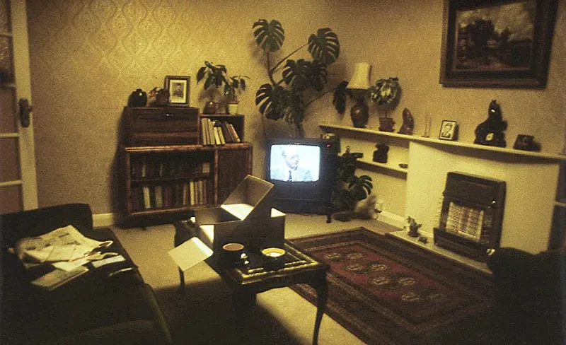
Photo: Gmihail at Serbian Wikipedia, CC BY-SA 3.0 rs, via Wikimedia Commons
Most of us choose prints at the wrong distance. We zoom in on a product page, squint at the clever details, fall for a film poster with the entire credits block rendered in three-point type — then hang it four metres from the sofa and wonder why the wall feels oddly blank. The print is fine. The viewing distance is the problem.
Buying art for a British home is rarely about a white-cube gallery moment. It’s about the two-and-a-half metres between the sofa and the chimney breast, the metre-wide slice of hallway you pass at speed, the corner above the desk you only really look at when the laptop freezes. If a print can’t do its job from those spots, it’s the wrong print for that wall — however good it looked on your phone.
Start with where you’ll stand, not where you’ll hang
Before you add anything to a basket, work out your regular viewing points. Not the one-off moment when you stand nose-to-glass to admire the paper stock. The actual, daily distances: kettle to kitchen wall, pillow to bedroom wall, doorway to living-room wall. That farthest reliable viewpoint is the one that should veto or approve the purchase.
Think of it as the doorway test. Stand in the doorway, look at the empty wall, and ask what job the print needs to do from there. Does it need to set a mood, carry a colour, or simply stop the wall feeling like a waiting room? A busy A2 film print with tiny crew names may be a joy up close, but from the doorway it can collapse into a grey rectangle. A word-first A3 — three big words, strong contrast, no fuss — will still land from the sofa. That’s not a rule about taste. It’s a rule about type scale and visual noise.
The tape-and-paper test (no drill required)
You don’t need to buy the print to find out whether it works. Cut a sheet of paper or newspaper to A3 or A2, tape it to the wall with low-tack tape, and live with it for a week. Mark your farthest regular viewing spot with a bit of tape on the floor. Then do the honest walk: from that spot, can you tell what the print is about? Can you read the main word, recognise the subject, feel the shape?
If the answer is no, don’t automatically size up. Sometimes the fix is a simpler design rather than a bigger sheet. A small, punchy print can beat a large, foggy one. The paper test also saves you from the classic UK flat mistake: buying an A2 because it feels like proper art, then discovering it visually swallows a 3.2-metre living room. Use the paper mock-up to check proportions against the sofa, the lampshade, the door frame. It’s free, it’s reversible, and it’s far less annoying than patching nail holes.
Room by room: where distance changes everything
In a typical living room, the sofa-to-wall gap is often somewhere between 2.5 and 3.5 metres. That’s a long way for fine detail. High-contrast typographic gig prints, simple graphic film art and bold colour blocks tend to hold up. Dense illustration, low-contrast photography and anything relying on small text will need to be closer — or considerably larger — to register.
Hallways are the opposite puzzle. A long, narrow corridor gives you two viewing modes at once: a close, side-on glance as you pass, and a long view from the far end. Prints with a strong silhouette and one clear idea work best. A row of tiny, detailed prints becomes visual static. One confident piece at the end of the hallway can do more than six polite ones along the side.
Bedrooms are usually viewed from the pillow in low light. Pale, subtle prints can vanish entirely after dark. If the print is meant to be seen from bed, go for stronger contrast and a simpler image. Kitchens are viewed from the doorway while the kettle boils — another case for boldness over intricacy. Home offices and studios are the exception: you’re often within a metre of the wall, so detailed prints, tracklistings and crew-block film art finally get the audience they deserve.
Small flats and long hallways: the awkward geometry
In a small flat, the temptation is to go tiny everywhere. Resist it. One strong A3 with a clean graphic shape can make a box room feel deliberate rather than cramped. Two matching A3s can handle an awkward chimney breast without turning the wall into a gallery grid. What you want is a clear anchor at your main viewing distance, not a scatter of small things that only work when you’re standing still.
Long hallways reward repetition less than you’d think. A neat row of identical frames can look smart, but only if each print reads from the far end. If they don’t, the hallway becomes a corridor of blur. Renters should tape the paper mock-ups first, then choose hanging strips or hooks that suit the wall — and keep the deposit in mind. The doorway test is especially useful in rented flats, where you can’t easily move a radiator or repaint a dark corner.
Three rules to shop by
First, if you can’t read the main word or identify the subject from your farthest regular seat, treat it as a close-view print. Put it where you’ll actually be close. Second, busy detail needs proximity; bold type and simple shapes travel across a room. Third, buy for the wall you have, not the zoomed-in product photo. A print that needs a gallery spot in a flat that doesn’t have one is a future regret.
And if you already own a print that fails the test, don’t force it. Move it to the hallway, the desk wall, the spot by the bedroom mirror. Rotate it with something bolder. Viewing distance is the one part of print buying that costs nothing to fix — but only if you measure it before you spend.