Tracklisting Your Walls: Why Music Prints Need a Running Order
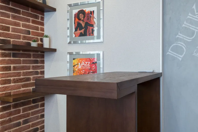
Most music walls start with good intentions: frame a few gig posters, add a favourite album print, maybe a risograph from a mate's band. Then another print arrives. Then another. Before long you're arranging by size, colour or whatever fits above the sofa, and the whole thing starts to look like a stockist's display rather than a portrait of your listening life.
A mixtape has a different logic. You don't put the loudest song first because it's the longest, or group all the sad ones together because they're the same shade of blue. You build a sequence. The wall can work the same way.
Start With the Opener, Not the Sofa
The first print you hang sets the tone. Treat it like track one: it should say something about the room without doing all the talking. In a small flat, that often means one bold image at eye level—a screen-printed tour poster, a hand-drawn jazz night flyer, an emerging illustrator's take on a beloved venue. Keep it to A3 or A2. A giant framed piece can work, but only if it has room to breathe.
Don't begin by measuring the gap above the sofa. Begin with the print you'd rescue in a fire. That's your opener. Build outwards from there.
Side A: Build a Mood, Not a Grid
Once the opener is up, resist the urge to make a perfect grid. Grids are fine for galleries and very tidy people; they can make a personal collection feel like a product range. Instead, sequence a side. Maybe the first three prints share a colour—mustard, oxblood, faded cream—or a scene, like London pub gigs from the same summer. Maybe they share a format: all A3, all unframed, all slightly wonky.
A useful rule for small spaces: three prints in a loose horizontal run above a desk or low shelf. Not measured to the millimetre. Just close enough to read as a conversation. Mix portrait and landscape if the art demands it, but keep the spacing consistent. Ten to fifteen centimetres between frames is usually enough; less if the frames are thin, more if they're chunky.
Deep Cuts Need Breathing Room
The temptation is to fill every gap. Don't. Deep cuts work because they're not the singles. A small, odd-sized print—a ticket stub reproduction, a photocopied fanzine page, a risograph from a Peckham print fair—needs empty wall around it to register. Give it a solo spot: beside a doorway, above a record shelf, at the turn of a corridor.
This is also where emerging design prints earn their place. A classic gig poster from a long-gone venue carries history; a new print by an independent artist carries personality. Put them near each other, but not on top of each other. Let the old one be the anchor and the new one be the aside.
The Closer Is a Full Stop
Every good sequence ends deliberately. On a wall, the closer is often the print at the edge of the arrangement—the one that stops the eye before it drifts into the next room. It might be the biggest piece, or the quietest. It might be a lyric sheet, a venue sign, a portrait of a beloved artist in monochrome. What matters is that it feels final.
If your wall runs along a hallway, use the end of the run as the closer. If it's above a sofa, the bottom-right or bottom-left corner often does the job. Don't add a random small print just because you have one left over. That's how a mixtape becomes a data dump.
Small-Flat Rules That Actually Work
- Hang at eye level. For most people that's around 145–155cm to the centre of the print. In a rented flat, use removable strips rated for the frame weight, not just the print.
- Keep the bottom edge consistent when prints are in a row. It creates calm without needing a ruler.
- Mix frame finishes if the art is varied, but repeat at least one element—black frames, oak frames, no frames—so it doesn't look chaotic.
- Leave one wall mostly empty. A music wall hits harder when it isn't competing with every other surface.
- Don't hang art directly above a radiator or in direct sunlight. Paper fades, and Blu Tack melts. Both are sad.
Mixing New Designs With Old Gig Artwork
The best music walls feel like a crate-digger's shelf: old and new in the same breath. A 1970s punk flyer reproduction next to a 2026 screen print from a Bristol illustrator can be electric if the colours rhyme. A glossy reissue poster next to a matte risograph can work if the frames match. The rule is simple: let each piece keep its own voice, but give them a shared rhythm.
And don't worry about provenance. A wall isn't an archive. If a print makes you remember a gig, a song, a person, it belongs in the sequence. The point is not to prove your taste. It's to make a room that sounds like you.
Stop Before It Becomes a Shop Display
The final check is simple: stand back and ask whether the wall looks like it was arranged by a person or merchandised by a brand. If every frame is identical, every gap perfect, every print the same size, you've probably overdone it. Loosen a corner. Move the deep cut. Leave a gap.
A mixtape isn't better because it's full. It's better because someone chose the order. Your wall deserves the same courtesy.