Set in Ink: Why Word-First Music and Film Prints Are the Smart Wall Buy Right Now
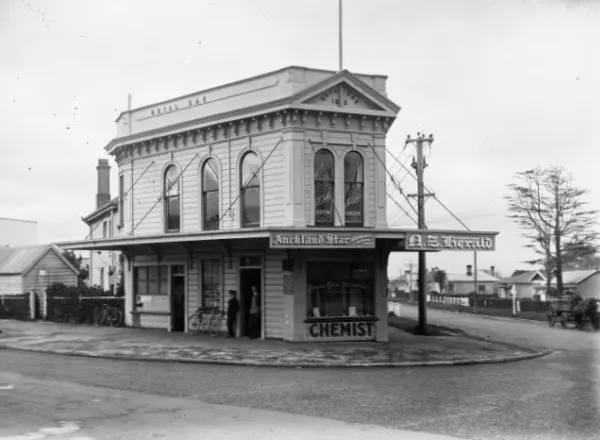
Photo: William Archer Price. Died 1948. Note NZ copyright term explained below., Public domain, via Wikimedia Commons
There’s a particular kind of poster that doesn’t shout. It doesn’t have a exploded-skyline blockbuster image or a band photo shot through a fog machine. It’s just words — a lyric, a film line, a title set in a typeface that someone actually thought about. And in 2026, that quieter, text-led print is becoming the smart buy for UK walls.
At Zip! Posters, we’ve noticed the shift in what people are asking about: less ‘where can I get the biggest Marvel montage?’ and more ‘who sets lyrics properly?’ It makes sense. Word-first prints suit rented flats, small studios and anyone who wants a wall that says something without saying too much. They also ask more of the buyer. A bad typographic print is very bad. A good one is a small piece of design history.
Why words are winning in 2026
Image-heavy posters have had a long run. They’re immediate, nostalgic and easy to understand from across a room. But they also fight for attention with everything else in a small flat — the telly, the bookshelf, the bike leaning against the wall. A typographic print calms that down. It gives the eye a shape to read rather than a scene to decode.
There’s a practical reason too. In a rental, you might have one good wall. An A3 or A2 text print can hold that wall on its own. It doesn’t need a gallery grid or a mood board around it. And because the design is built from letterforms, it can be printed sharply at a modest size. You don’t need a huge budget to get something that feels considered.
The collecting side is real as well. Limited-run lyric prints from small UK studios are starting to move like gig posters did a few years ago. People are buying them because they like the type, the band, the film, the printer — not because a algorithm told them to. That’s a healthier kind of collectible.
What makes a typographic print actually good
Start with hierarchy. Good type-led design tells you where to look first, second and third. A film title might be the anchor; the quote sits underneath; the studio mark is small and tidy at the bottom. If everything is the same size and weight, your eye slides off it.
Then look at spacing. Kerning — the space between individual letters — matters more than most people realise. A cheap print often has letters that look like they’ve been shoved together on a bus. A good one has breathing room. Check the margins too. If the text is crammed to the edge of the paper, it will look nervous in a frame.
Paper and ink are the tell. A decent giclée or screen print on matte stock will hold fine lines and small type. A glossy budget poster will flare under a lamp and make delicate letterforms look smudgy. If you’re buying online, look for paper weight and finish in the listing. If it just says ‘high-quality print’, ask yourself what that actually means.
And check the source. A lyric print should credit the songwriter or use a licensed design. A film quote print should be clear about whether it’s official, fan-made or a studio release. That’s not just ethics — it’s a clue to how much care went into the thing.
The cliché traps — and how to dodge them
We all know the prints. ‘Live, Laugh, Love’ in a curly script. A film quote in a brush font that looks like a greetings card. A lyric crammed into a heart shape. These aren’t typography; they’re decoration with words attached. They rarely age well, and they can make a room feel like a waiting area.
The easiest way to avoid them is to ask: would this look good if the words were in a different language? If the answer is no, the design is probably leaning on the quote rather than the type. Good typographic prints work as shapes before you even read them.
Also beware of ‘minimalist’ film posters that are just a tiny title in the middle of a huge white sheet. That’s not minimalism; that’s a lack of ideas. The best word-first prints use scale, weight and negative space with intent. They feel composed, not empty.
Styling words on walls in small flats and studios
One strong text print is usually enough for a small room. Put it at eye level, give it a decent mount, and let the wall breathe. If you’re renting and can’t drill, use a ledge shelf or a freestanding frame leaning against the skirting. Command strips work for lightweight frames, but check the weight limit and don’t hang anything precious above a bed.
In a studio or desk corner, a typographic print can do the work of a mood board without the clutter. A lyric print above a turntable, a film title beside a shelf of DVDs or Blu-rays, a gig poster with the date and venue set cleanly — these all make sense together because they’re all word-led. Just don’t mix five different fonts in one cluster. Pick a lane: all grotesk, all serif, or one accent piece.
Colour is your friend, but use it sparingly. A black-and-white type print with one red line can be enough. If your room is already busy, go for toned paper — cream, grey, ecru — rather than bright white. It’ll sit softer against rented magnolia walls.
Building a small collection without regret
Buy the print you’d still like if the band broke up or the film left the streaming platforms. Follow UK studios and small presses on social media, sign up to their newsletters, and pay attention to edition sizes. A signed run of 50 is a different thing to an open-edition print that will be restocked forever.
And give yourself permission to start small. One A3 lyric print in a decent off-the-shelf frame can change a room more than a wall of rushed bargain posters. Words on a wall should earn their place. When they’re set well, they do.